
Bellosom is a regional florist that helps people purchase flowers. Their catalogue boasts a variety of arrangements to choose from with an easy way of finding and purchasing flowers. Bellosom targets customers who frequently buy flowers without having to step foot in a physical store.

The Problem
Busy workers and commuters lack the time to find and purchase flowers in order to get their arrangements on time for their event or occasion.
The Goal
Design an app and web experience for Bellosom that allows users to easily find, purchase and track their floral arrangements.
My role
UX designer and Art Director
Project Duration
September to October 2023
Responsibilities
User Research, Wireframing, Prototyping, Usability Testing


User Research
I conducted interviews and created empathy maps to understand the users I’m designing for and their needs. A primary user group identified through research was working adults who need to find floral arrangements for various occasions.
This user group confirmed initial assumptions about Bellosom’s customers, but research also revealed that an easy checkout process and tracking your purchase influenced the design of this app. User pain points boiled down to…
1. Limited Availability
Users may struggle to find the specific flowers they desire, especially if they are looking for rare or seasonal blooms.
2. Lack of Transparency
Users often encounter the pain of hidden costs or unclear pricing when using floral apps.
3. Delivery Uncertainty
Users often want to know the exact delivery window for their flowers, especially for events or surprises.
Taking the time to draft iterations of each screen of the app on paper ensured that the elements that made it to digital wireframes would be well-suited to address user pain points. For the home screen, I prioritized a quick and easy ordering process to help users save time.

As the initial design phase continued, I made sure to base screen designs on feedback and findings from the user research.

Full transparency into the product helps the user make an informed decision before they add to cart.

Using the completed set of digital wireframes, I created a low-fidelity prototype. The primary user flow I connected was finding and purchasing a floral arrangement, so the prototype could be used in a usability study.

Early designs allowed for transparency into each product, but after the usability studies, I added additional options to view similar items. I also revised the design so users can alter the quantity before they add to cart.

The second usability study revealed that there are inconsistencies with the visual system. To solve for this, I made sure the gradient motif was more prevalent throughout the app since it was introduced in the load screen.

The final high-fidelity prototype presented cleaner user flows for finding and purchasing floral arrangements. It also met user needs for more transparency, customization and overall personalized experience.


As I designed the desktop experience, I kept the user in mind by making sure the journey for purchasing floral arrangements would be as close as it can be to the app. More screen space to utilize allowed me to fit more information within the UI and provide familiarity to the user as the designs are inspired by existing e-commerce experiences.

Designing a site map was going to be crucial since the desktop experience is giong to be much less linear compared to the app. My goal here was to make strategic information architecture decisions that would improve overall website navigation. The structure I chose was designed to make things simple and easy.

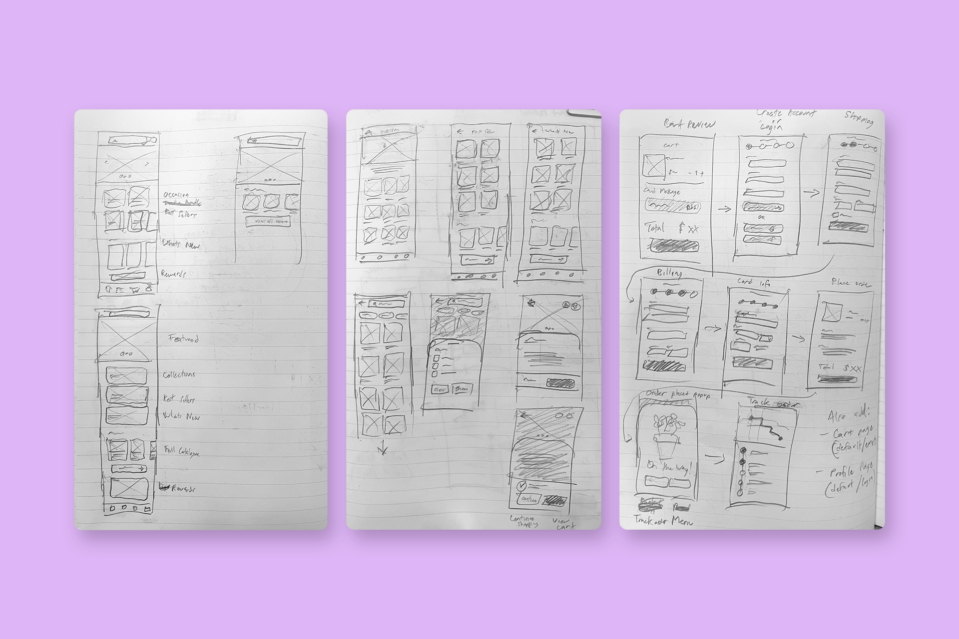
Next, I sketched out paper wireframes for each screen in my site, keeping the user pain points in mind. Sketching out my screens allowed me to iterate quickly so that I could move forward with a layout that best addressed the user needs.
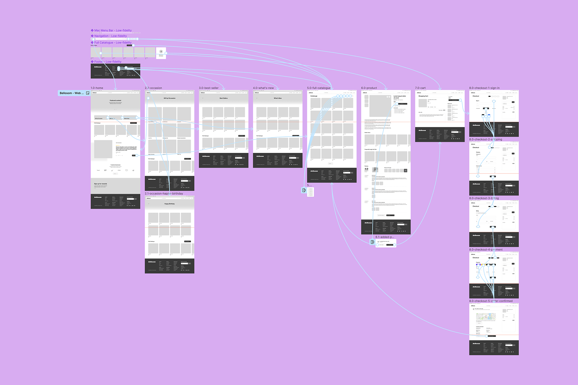
Moving from paper to digital wireframes made it easy to understand how the experience address user pain points and improve the user experience. To create a low-fidelity prototype, I connected all of the screens involved in the primary user flow.

After testing out the low-fidelity prototype, I made updates that would further improve the user experience. At the same time, I applied brand and visual elements to produce a prototype that would look as close as it would to a live web experience.


Takeaways
Impact
The app and website makes users feel like Bellosom really thinks about how to meet their needs and created a seamless solution for ordering flowers.
One quote from peer feedback stated: “This is well put together. I can see this being a powerful app for all things flower-related!”
What I Learned
While designing the Bellosom app, I learned that the first ideas for the app and site are only the beginning of the process. Usability studies and peer feedback influenced each iteration of the app’s designs.