Wunderkind
Reimagining long-form content as modular templates to empower teams at scale
My role
UX designer and Art Director
Project Duration
September to October 2023
Responsibilities
User Research, Wireframing, Prototyping, Usability Testing

Wunderkind is a performance marketing solution that helps brands acquire new customers at scale and keep them loyal for life. With adoption in mind, our team at Ceros set up these interactive experiences to help their team scale content creation through Studio.
The Problem
Wunderkind had difficulty proving the value of Ceros as their online content was handled by web developers. Their internal teams needed to push out interactive content without the need for code.
The Solution
Provide support to two different teams without alienating one over the other. One team needed help with designing a bespoke, long-scroll teaser page while the other needed help with a templated interactive guide.
IDaaS
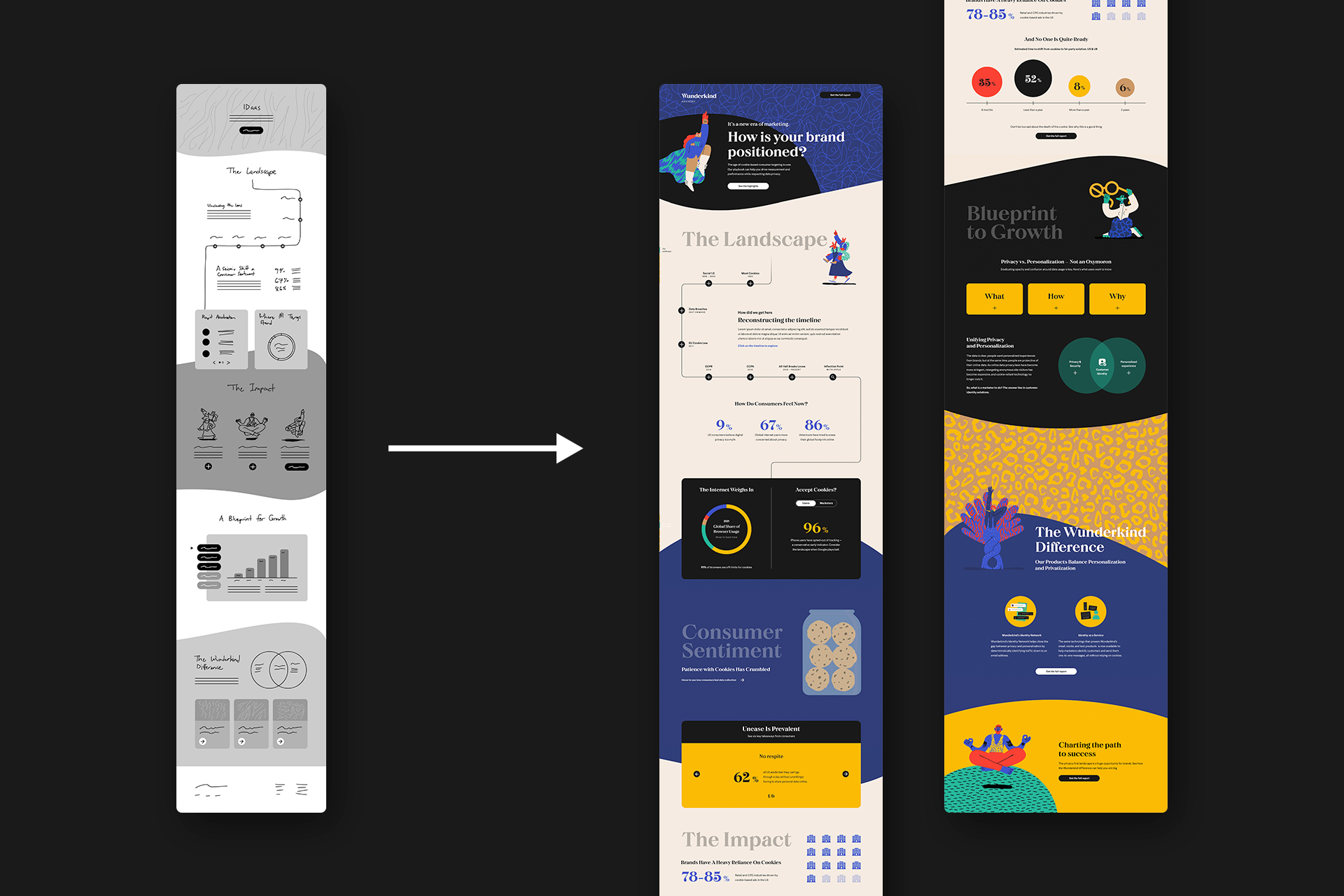
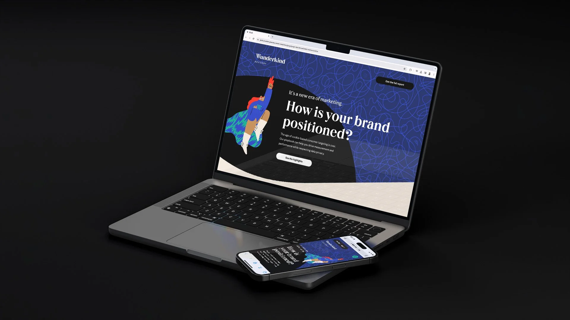
I created this robust report teaser to highlight one of Wunderkind’s offerings, Identity as a Service (IDaaS). The content provided was in the form of a large scale report, so our goal for this experience is to present the key information to the user.
1. Keep modularity in mind
Sections are inspired by assets from the stylescape with some welcome additions that are designed to be reused in new experiences.
2. Build as a template
Built as a template, Wunderkind can adjust and tailor the content as needed. It would change as more reports are published.
3. Design as a training tool
The experience is designed to be easily understood in order to boost their Studio capabilities and implement UX/UI best practices.

Having a lot of content to work with inspired two different directions that Wunderkind could move forward with. After reviewing the concepts, we decided to move forward with a bespoke, long-scroll teaser page.

Much of the modules from the stylescape inspired the interactivity in this experience. This encouraged the Wunderkind team to scale content creation without having to start from scratch.

As I carried out the design from concept to development, implementing interactivity and animations allowed users to stay engaged with the content so they feel encouraged to download the full report.

Designing the mobile version of the page came with ease as the modules from the desktop would stack on top of one another within mainly a single column and, at most, two.


Text Message Playbook
Following the momentum from the IDaaS experience, I built this educational resource that would highlight best practices on how to engage audiences through SMS Text messaging campaigns. This playbook would assist their audience in boosting their revenue and connect their customers with products they love.

The content provided was a long form PDF report. Upon reviewing the content, I noticed that there was a clear structure that eventually serves as the foundation of the experience.

The structure I provided allowed the Wunderkind team to easily adjust text and visuals as needed. This framework could also be used as a template to create other interactive resources - making content creation easy.

The Results
Throughout our relationship with Wunderkind, we we able to provide support to limited bandwidth, templates to support efficient workflow and also provide training to boost their team's capabilities. Given the short time frame, our solution to working with Wunderkind was to set them up with a stylescape and develop a build for each team. Based on the content provided, we noticed that one of the builds required more of a bespoke approach while the other allowed us to create a templated approach. This allowed me to balance out my priorities while making sure both teams' needs were met. After building out each design, both teams were happy with the results and led to the decision to renew their subscription.
Selected Works


