Flip Academy

Transforming financial education into play for increased engagement


Team & roles

Jesh Anies (me) - UX & UI Designer / Team Lead
Deepthi Vasudevan - UX & UI Designer
Kulsum Zaidi - UX & UI Designer
Laura Trouiller - Mentor

Project Duration

August 2025

Responsibilities

Mentorship, Project management, Client Communication, Research synthesis, Wireframing, Prototyping

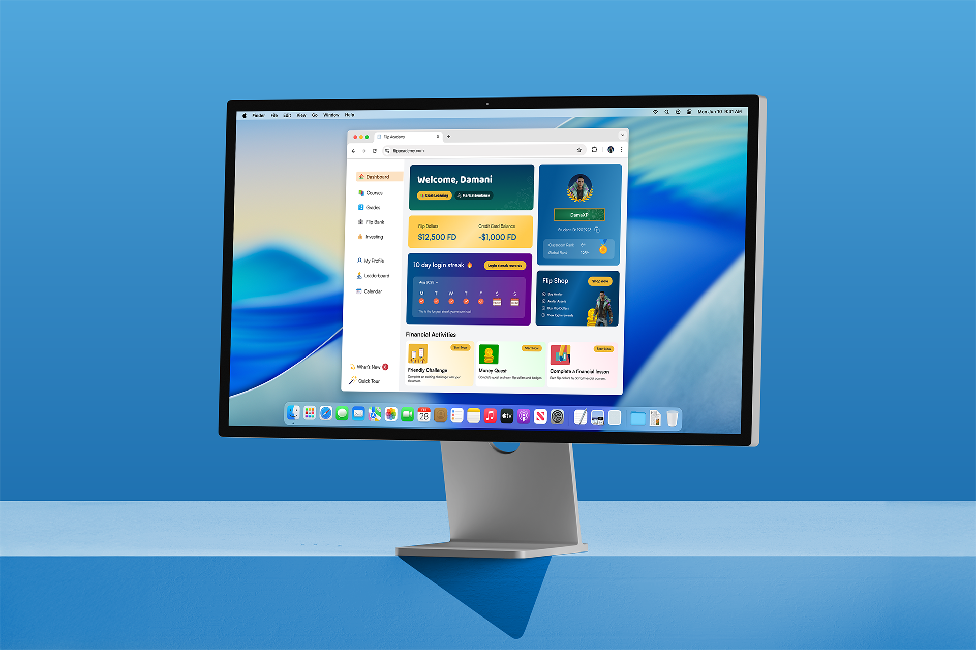
Gamified financial education for students

Founded by Andre Smith, Flip & Floss strives to help 3rd-12th grade students understand credit, debt management and other key money management concepts. Their innovative edtech platform, Flip Academy, teaches these students how to manage, save, and invest money. By partnering with schools, teachers and parents all over the globe, Flip & Floss seeks to break generational cycles while building the financial skills to excel in life.

To understand how the Flip Academy platform works, teachers assign courses to students based on their grade, competency or level of comfort. Once courses are assigned, students engage in immersive learning around money management. Each course comes with quizzes, games, activities and milestones to help teachers better engage their students. Flip Academy also incorporates play to keep students engaged by incorporating gamification elements. Some of the gamified elements include: 

  • Unlocking rewards by completing courses

  • Personalization and customization with profile cosmetics

  • Competing in classroom and global leaderboards

The solution

Design and implement gamification features that are intuitive, educational, and enjoyable for students to build essential financial skills through play and exploration.

The problem

Despite the growing importance of financial literacy for young learners, traditional educational methods often fail to capture students' interest and promote long-term engagement. Flip Academy by Flip & Floss recognizes the need to make financial education more interactive and accessible. The challenge is to increase student engagement by integrating gamification and simulation techniques into the existing Edtech platform.


Research Synthesis

User Interviews

Prior to our project, a previous group had collaborated with Flip & Floss to conduct user interviews and research whose results would inform our team’s understanding of Flip Academy’s lack of engagement. 

Method

Participants that were involved in the research interviews were minors and needed parent and guardian approval. During the interviews, participants were also informed that the nature of the study is to improve the Flip Academy platform to make it more engaging and that any notes taken on their responses would be solely used to inform design decisions. Moderated discussion-style interviews were conducted to gain a deeper understanding of the problem

Hypothesis

Their study aimed to test the following hypotheses and determine if these assumptions are well founded…

  • The app's engagement potentially needs to be based more on finance-related gamification elements to keep kids interested.

  • Some sort of incentive potentially needs to be applied for kids to share their experience with the app, build friendly competition and spread its messaging.

  • Kids who look at Flip & Floss potentially may feel alienated by the design language and content.

Key Insights

After interviewing the participants, the results were organized to four key themes and insights…

  • Kids are most engaged by short, rewarding experiences with instant gratification, leaderboards, and opportunities to share achievements. Social competition and real or perceived value (like in-game currency or rare items) drive sustained use.

  • Overly complex interfaces discourage engagement. Clear, simple, and visually engaging designs make apps and games more approachable and enjoyable.

  • Peer interaction, sharing milestones, and meaningful notifications (from friends, family, or time-sensitive events) foster engagement, while generic alerts are ignored.

  • Kids understand basic saving/spending but struggle with long-term planning and abstract concepts. They respond best to relatable, real-world applications—like chores, odd jobs, and tangible rewards that give in-app currency real impact.

Persona

Thanks to the research provided to us, our team put together a persona to be mindful of the type of user we would be designing for. Meet Dev.

How Might We

Using the information gathered from Flip & Floss, my team and I brainstormed a list of guiding questions which set the foundation for providing a solution to the problem:

  1. How might we design rewarding, challenge-based experiences that make learning feel like play and keep students coming back for more?

  2. How might we build friendly competition and social interaction into the platform in a way that boosts motivation and fun?

  3. How might we transform mini video courses into playful, interactive journeys that engage middle schoolers and build financial skills?


Ideation

Initial Ideas

Moving into the ideation stage, my team and I decided to use our how might we questions to generate solutions to the problems that were identified. Below is a list of potential ideas that could be used to increase engagement through gamification techniques…

    • Daily login rewards for logging in

    • Unlock login streak rewards after consecutive days of activity

    • Weekly challenges

    • Seasonal events or time-limited challenges (e.g., summer savings streak).

    • Peer shoutouts when someone hits a milestone

    • Stylish borders shown on profiles avatar pic

    • Apply nameplate badges or titles to my username (e.g., “Super Saver,” “Chore Champ”).

    • Apply background themes

    • Send a challenge to a friend.

    • Let students choose a storyline or character journey before starting a course (e.g., “The Entrepreneur,” “The Saver,” “The Giver”).

    • Mini pop quizzes within the video

    • Rewards displayed upfront in the video before the rest of the video plays

Inspiration

Moving into the ideation stage, my team and I decided to use our how might we questions to generate solutions to the problems that were identified. Below is a list of potential ideas that could be used to increase engagement through gamification techniques…

Halo

The classic FPS shooter, Halo, implemented nameplates as a way to personalize your experience and allow players to apply personality to their profile; a visual to your username.

Duolingo

Language learning can be fun, and engaging. Duolingo takes it a step further by encouraging its users to consistently learn with streaks. It’s playful use of visuals and animation create a sense of achievement for learners.

League of Legends

The famous MOBA gives players the option to customize their profile picture with borders. In this example, borders can be unlocked as you level up. The higher the level, the more visually intricate the border design is.

Seasons in League of Legends are annual, multi-act cycles that bring thematic events, major gameplay changes, new content, and ranked resets to the game. A way to keep the game feeling fresh every year.

Subway Surfers

In addition to the main objective of the game, Subway Surfers implements a daily challenge system that gives players rewards by completing a set of tasks to collect certain letters.

Similar to the daily challenges, the mobile game also implements a weekly hunt. This additional set of tasks gives players more time to complete additional objects with the same objective of unlocking additional rewards.

User Stories 

After listing out our initial ideas, I fleshed out user stories that would be included in the Minimum Viable Product (MVP). I focused on core scenarios that a user would experience for increased engagement on Flip & Floss.

  • As…

    A student

    I want to...

    Get daily rewards for logging in

    so that...

    I feel incentive to log in

    Priority

    1

  • As…

    A student

    I want to...

    Unlock login streak rewards after consecutive days of activity

    so that...

    I can get rewards that escalate with streaks (e.g., flip dollars, multipliers, cosmetics) and maximize my earnings

    Priority

    1

  • As…

    A student

    I want to...

    Participate in weekly challenges

    so that...

    I can compete against my classmates, earn and learn more in addition to the course material that's available

    Priority

    2

  • As…

    A student

    I want to...

    Participate in seasonal events or time-limited challenges

    so that...

    I can compete against my classmates, earn and learn more in addition to the course material that's available

    Priority

    2

  • As…

    A student

    I want to...

    View shoutouts when a peer hits a milestone (13 and up)

    so that...

    I feel encouraged to strive or exceed those milestones

    Priority

    1

  • As…

    A student

    I want to...

    Apply stylish borders to my profile avatar pic

    so that...

    I can personalize my profile cosmetics and show it off when displayed on leaderboards

    Priority

    1

  • As…

    A student

    I want to...

    Apply nameplates to my username

    so that...

    I can personalize my profile cosmetics and show it off when displayed on leaderboards

    Priority

    1

  • As…

    A student

    I want to...

    Apply a background theme

    so that...

    I can personalize my learning experience

    Priority

    3

  • As…

    A student

    I want to...

    Send a challenge to a friend

    so that...

    I can invite a friend to complete a multiplayer-style course together and unlock rewards

    Priority

    1

  • As…

    A student

    I want to...

    Choose a storyline or character journey (e.g., “The Entrepreneur,” “The Saver,” “The Giver”)

    so that...

    I can personalize my learning journey

    Priority

    3

  • As…

    A student

    I want to...

    Answer pop quiz questions while watching a course video

    so that...

    I stay engaged while watching course videos

    Priority

    1

  • As…

    A student

    I want to...

    Review the rewards upfront in a course video before the rest of the video plays

    so that...

    I am reminded of what rewards I'll unlock after finishing the course

    Priority

    1

With an abundant list as our starting point, our team regrouped and checked in with the client to make sure we are prioritizing the key solutions given our time constraints. After review, we decided to prioritize and design 7 user stories along with user flows to focus on the key scenarios for the MVP.

  • As…

    A student

    I want to...

    Get daily rewards for logging in

    so that...

    I feel incentive to log in

  • As…

    A student

    I want to...

    Unlock login streak rewards after consecutive days of activity

    so that...

    I can get rewards that escalate with streaks (e.g., flip dollars, multipliers, cosmetics) and maximize my earnings

  • As…

    A student

    I want to...

    View shoutouts when a peer hits a milestone (13 and up)

    so that...

    I feel encouraged to strive or exceed those milestones

  • As…

    A student

    I want to...

    Apply stylish borders to my profile avatar pic

    so that...

    I can personalize my profile cosmetics and show it off when displayed on leaderboards

  • As…

    A student

    I want to...

    Apply nameplates to my username

    so that...

    I can personalize my profile cosmetics and show it off when displayed on leaderboards

  • As…

    A student

    I want to...

    Send a challenge to a friend

    so that...

    I can invite a friend to complete a multiplayer-style course together and unlock rewards

  • As…

    A student

    I want to...

    Review the rewards upfront in a course video before the rest of the video plays

    so that...

    I am reminded of what rewards I'll unlock after finishing the course

User Flow

We then designed user flows to help visualize the various scenarios a user undergoes to accomplish each task from the seven MVPs.


Design

The Design System

Before bringing our team’s vision to life, Flip & Floss requested that our designs resemble the future iteration of Flip Academy’s user interface which was vastly different from what is currently live.

Current Iteration

The current iteration of Flip Academy is an online desktop, dashboard experience that leans in on the brand’s main colors, blue and yellow, with Nunito Sans for the type. Its corporate approach allows for information to be organized neatly while incorporating a few gamification elements. However, without any playful or vibrant characteristics, students find it difficult to stay engaged with and develop financial acumen

Future Iteration

On the other hand, the updated iteration utilizes more playfulness and vibrancy that kids resonate with. Taking inspiration from mobile and console gaming, the new direction opened up the design to more flexibility and innovation. This opened up room to include key gamification features like your avatar and cosmetics, leaderboards, and unlocking rewards with the Flip Shop using the in-game currency attained from completing courses. The type system was updated to include Baloo and Satoshi, deviating away from Nunito Sans. Though this version has not been launched yet, our team was excited to work with the updated design system. As team lead, it was imperative my team had access to this prototype so that we can be consistent with the updated design and be efficient with our time constraints.

Sketches

Once my team’s ideas were organized into user stories and flows, it was time to put pen to paper and sketch out how the user interface would potentially look like. While screens didn’t have to be drawn perfectly, they needed to be clear enough for the ideas to be understood when gathering feedback from a fresh set of eyes. To establish consistency between our team’s sketches, I had us sketch within a template that resembled the frames’ aspect ratio based on Flip Academy’s figma prototypes. The stars on our sketches represent which ideas we moved forward with for each user story/flow.

Wireframes

After putting together my sketches, I then built out wireframes in Figma and made further adjustments now that I saw things in a digital framework. Designing in this stage allowed me to add more context to the UX by including live copy to help the user understand how to navigate the interface and how their actions would affect the experience. This also allowed me to begin implementing foundational design elements such as a grid system so that I could establish spatial relationships between components in the interface as well as the type hierarchy between content so I could separate out the text between header and body type.

One idea we explored during this stage (that wasn’t part of our sketches) was considering whether to nest peer shoutouts under ‘Leaderboard’ or under a dedicated ‘Notification’ page. After reviewing with the client, we decided to leave peer shoutouts under the ‘Leaderboard’ section and remove the ‘Notification’ section from the wireframes.

To access how the user would change their profile border and nameplate, we had to redesign the ‘My Profile’ page as we expected the user to edit their profile cosmetics through there. Additionally, we used it as an opportunity to include your personal details with text fields that allow the user to change their info if needed. 

Wireframing allowed us to focus the foundational elements of the UI along with the user experience to stay efficient with our time and avoid over-designing something that could potentially need major changes.

Hi-fidelity Prototype

A strong direction set from our wireframes allowed our team to dive into building a high fidelity prototype that users can interact with. This is where we applied a comprehensive design direction that is aligned with the updated designs that the client has yet to launch for Flip Academy. To stay consistent with the persona we were designing for, our approach to the prototype retained the sense of playfulness and vibrancy while finding ways to organize information for increased clarity and accessibility. 

In order to connect our solutions to what has already been created by the client, our team needed to design additional screens and adjust existing screens so that interacting with the prototype is seamless for the end user. These updates include:

  • Including a redesigned login screen as a natural starting point for users testing our prototype.

  • Adjusting the dashboard screen to have less CTA emphasis on accessing your profile and more on marking your attendance and accessing the course material.

  • Updating the leaderboard UI to include additional information to include for peer milestones and profile cosmetics (profile border and nameplates).

  • Adding an additional tab to view login rewards under the Flip Shop. By placing login rewards under Flip Shop, there could be a relationship to other unlockable rewards.

  • Designing additional screens for users to invite peers to join their party and participate in friendly challenges together once people have accepted the invitation and joined your party.


Test

Client Feedback

Before testing the prototype with student participants, our team checked in with the Flip & Floss team to review the designs. After reviewing, they came back with valuable feedback that was implemented to improve the UX of the prototype. 

Below is how the prototype was updated. The changes include:

  • Improving accessibility and simplifying the CTA system with color properties. We removed gradient usage from CTAs so that there’s distinction between text and background color. Additionally, color usage for CTAs originally varied between blue, green and yellow. Our team decided to use yellow as the primary CTA colors as blue and green were typically used for alternative background colors.

  • Adjust the language to be more engaging and kid-friendly. This applied mainly for features for login rewards and marking attendance where the copy was updated to sound more casual. For example, from “Mark your attendance” to “Boom 💥 You’re in! Now keep the momentum going”

  • Condense the cosmetic adjustments under one dropdown menu when you are editing your profile. This was done to avoid having an abundance of similar CTAs such as ‘Change Profile Picture’, ‘Change Border’, and ‘Change Nameplate’.

  • Implementing a way for peers to view which friendly challenges their friends have joined. To convey this, we made the Avatars appear on a specific challenge, giving the user the ability to join the challenge from there.

Usability Testing

After iterating on the prototype from the client’s feedback, usability testing was conducted to evaluate the Flip Academy’s overall usability, identify any friction points, and assess whether users can navigate key features intuitively. Because of their partnership with schools, Flip & Floss was responsible for recruiting participants. After reaching out to potential participants, the client was able to schedule 2 participants for testing who have never used Flip Academy and have allowed us to test with parental/guardian approval. Once testing was complete, insights and feedback were logged regarding user behavior to help refine the interface.

Reactions from participants garnered mixed feedback. The first participant fell within the target age for the ideal user who’d use Flip Academy. This participant had strong appreciation and excitement for features like login rewards, attendance rewards and adjusting profile cosmetics. On the other hand, the other participant was below the target user age. This participant struggled to navigate the tasks and understand the purpose of gamification features like rewards and leaderboards. The experience from testing both participants identified improvements to the user experience - most of them could be easily adjusted with one critical problem to consider.

Below is how the low-fidelity prototype was updated based on user feedback…

🔴 Critical Feedback

One critical piece of feedback that was suggested was to move login rewards to the dashboard and redesign the dashboard page to include login rewards as participants could not determine that rewards would be nested under Flip Shop. Upon moving the rewards, the component was removed from the flip shop entirely. Initially, the idea made sense as login rewards felt like there was a relationship with purchasing unlockable rewards from the in-game currency gained from completing courses. After the testing, our team realized that kids aren't necessarily making that connection the way adults do with experience from other apps and dashboard experiences.

🟠 Major Feedback

While not as critical, these edits further enhanced the user in various ways such as…

  • Adjusting the CTA copy to be more conventional for marking your attendance. This comes as one participant could not identify the “I’m at school” CTA on the dashboard. To solve this, we replaced “I’m at School” in the CTA with “Mark Attendance” across all the dashboard screens and replaced the CTA text “Mark Present” CTA with “I’m here” in the pop-up message that opens after clicking in the initial CTA.

  • Making the “invite” CTAs clickable in the prototype for friendly challenges as both participants clicked on the invite CTAs to navigate to the next screen in the flow. Initially, our team incorporated clicking for the “Your Party” component to move to the next screen but in reality we should not have made that clickable because it isn’t interactive until someone joins your party so there was no need for applying an interaction there.

  • Redesign the course details page with more emphasis on the course overview so that the user will be prompted to view them on the course overlay screen. Both users assumed that the task ended here because they got to preview the rewards. By de-emphasizing the rewards on the course details page, the page could allow for more information regarding the course and learning material itself.

🟢 Normal Feedback

Simple edits included…

  • Adjust the CTA text for the cosmetic adjustment dropdown as the “Change Appearance” dropdown was not a clear indicator for profile personalization for one participant. The CTA copy was updated to say, “Change Profile and Nameplate”.

Other feedback to consider

While I was able to implement most feedback from usability testing, there were a few valuable suggestions I didn’t get around to. Here are a few examples…

  • Include text to clarify to the student that challenges can take place both during and outside of school hours. One participant needed clarity on whether the challenges can take place during or outside of school hours.

  • Add a 3D avatar on the leaderboard screens as one participant suggested showing the 3D avatar on the leaderboard screens.

Final Presentation and Handoff to Client

To conclude our project, our team presented the results from user feedback and showcased how the prototype was updated. We were met with applause as the Flip & Floss team reacted with praise for the work that we did to improve user engagement through gamification features. All that’s left to do was to handoff the user testing report to the client and provide edit access to our team’s Figma prototypes. That way, their developer can save a local copy and dissect the design to implement in the future version of Flip Academy. As our time came to a close, their founder, Andre, expressed gratitude with some kind words…

“You all went above and beyond what was normally expected and designed so many frames. When we first started Flip & Floss, we had no idea how the product would turn out. In fact it had changed so much through the years that you wouldn’t recognize how it looked initially. All the iterations it has gone through was such an improvement on the original vision and I am personally happy that you got to contribute to its evolution to make financial education fun, accessible and engaging for students.”

- Andre Smith, Founder


Takeaways

What I learned

  • As team lead, one of my responsibilities was spearheading the communication with the client. Usually it meant that I would speak on behalf of our team in client meetings, and email them at other times. It also meant translating words that mean differently to our team. When we kicked off our project, the client would often say our goal was to “redesign things” which de-emphasizes our relationship with improving the user experience. To steer away from that thought, I had to question if the goal was to prioritize the gamification aspect of the UX. The client then confirmed and further clarified that the goal was to increase user engagement through gamification features, giving our team the direction to provide meaning.

  • As team lead, I made sure that my teammates were in a position to implement a meaningful solution to the client without any roadblocks. For me this meant that I would project manage our team’s work by gathering resources from the client, organizing our work under a shared drive, outlining an agenda for internal meetings, scheduling meetings. compiling questions and notes for client meetings, collaborating under the same figma files, and keeping our team accountable to the timeline we set in our project plan. Doing this allowed my teammates to focus on improving the user experience and increase engagement through gamification features.

  • Compared to my teammates, I had more experience working in design throughout my career. This allowed me to offer design mentorship in areas where my teammates had less experience in such as the visual and UI aspects of the project. In some cases I would offer straightforward suggestions to improve the UI/UX but there were opportunities where I didn’t necessarily provide the answers to a problem. In these cases, I presented my feedback as questions to help my teammates think for themselves. For example, when it comes to designing the components for friendly challenges, I would ask, “How might we adjust the colors so that they are consistent with the overall palette while establishing hierarchy between ‘inviting friends’ and ‘your party’?” This style of leadership challenged my teammates to better understand the design as a system that factors in principles such as hierarchy, weight, spacing, contrast, etc.

What I would do (or like to do) differently

  • Though I am grateful that my team and I had access to research insights conducted by another team, the key findings would feel more relevant if our team conducted the research. We would certainly feel more ownership when it comes to understanding the problem and be able to tailor interview questions to engagement and gamification.

  • It wasn’t till later in the project where our team realized we didn’t have the most up-to-date prototype. When we reviewed our high-fidelity prototype with the Flip & Floss team, they provided feedback on improving accessibility and simplifying the CTA system. During that same conversation, they had previewed designs where that feedback was addressed and already solved for. This led our team to believe that we didn’t have access to the latest designs. Having access to that design earlier in our timeline would've been ideal to have so that we could prioritize increasing user engagement with gamification features.

  • Scheduling participants was a difficult endeavor as students were on summer vacation, which meant that our team wasn’t able to meet our goal to test 5 users to test our solutions. Additionally, one of our participants was much younger than the average Flip Academy user so it was difficult for them to navigate the tasks and understand the purpose of gamification features. Regardless of the hand our team was dealt with, we still gained valuable insights from testing with just two users. Their reaction and feedback allowed us to refine the user experience and deliver an improved prototype for final handoff to the Flip & Floss team.