GalleryPal
Driving guest satisfaction through interactive museum experiences
Team & roles
Jesh Anies - UX Research & Design
Laura Trouiller - Mentor
Project Duration
May 3-7, 2025
Responsibilities
Research Synthesis, Wireframing, Prototyping, Usability Testing
Making the museum experience more immersive
Museums are constantly exploring ways to increase customer satisfaction when viewing art—making each visit more engaging, informative, and memorable. GalleryPal set out to design a mobile experience that deepens guest connection with artwork and transforms passive viewing into meaningful interaction.
Over the course of a five-day design sprint, I led UX research and design to explore how mobile technology could enhance the in-person gallery visit. My goal was to help guests feel more connected to the artwork, discover new pieces seamlessly, and leave with a deeper appreciation of what they’d seen.
The problem
Visitors often struggle to fully engage with or understand the art they’re viewing, leading to a less satisfying museum experience. GalleryPal saw an opportunity to enhance guest enjoyment using a device they already carry—their smartphones.
The solution
A mobile MVP that elevates guest satisfaction through features like artwork profiles, nearby art suggestions, map integration, and personal journaling—turning each visit into a more interactive and meaningful experience
Day 1 - Map
User Interviews
GalleryPal had already conducted user interviews to understand how people experience art in museums. My goal on Day 1 was to synthesize those findings and identify what most impacts visitor satisfaction. Visitors shared that long-form content made it difficult to get quick insights, limited context weakened their connection to the art, and they wanted to explore at their own pace without feeling lost. As one participant put it, “I enjoy looking at art, but sometimes I feel like I’m missing out on the full experience by not knowing the story behind it.”
A key interview between GalleryPal’s Lead Researcher, Joe Formica, and Lena Caroll, a tour guide at The Museum of Natural History, reinforced that guest satisfaction increases when visitors connect with the story behind the artwork. Lena found that combining artist context, history, and technique helps guests engage more deeply—especially when shared in digestible bites. She also emphasized reflection as a powerful way for guests to form personal connections with the art.
“Look closely at the work and reflect on what it means to you.”
“Artwork is meant to help you understand yourself.”
Thematic Analysis
Using an affinity diagram, I organized findings into four insights that directly relate to improving guest satisfaction:
-
Participants have noted that they’ve expressed their frustration with having to sift through too much. As Nick explains, “Sometimes I'll do a quick Google search for a painting while on my phone while at the museum ... but I usually just find long articles that are super overwhelming.” Another participant suggested that it’d be valuable if the artist could tell guests about the art if they had a minute to talk about it. Even Lena, with limited time, has to adjust and provide information in tidbits when presenting information about art during her tours.
-
It is said that museum goers know there's good art, but they don't know why yet. This was something Lena observed working at the The Museum of Natural History saying, “typical museum goers don't know much about the art before going in.” In another interview, Claire points out that she always finds a work of art that catches her eye that she didn't read about beforehand.
-
It was important that participants learned about the art to better connect with it. When Lena gives tours at work, her goal is to help guests create a story to better connect with the art. The key information can be categorized in three ways:
Background & context
Process & technique
About the artist
-
As mentioned, Lena mentioned that her hope was for guests to get something more out of it instead of walking around by themselves. Sometimes they miss a detail or overlook a detail. Her method of approach is to go in objectively so that guests come out with their own opinion. As a bonus, perhaps the guest finds a deeper understanding about themselves by reflecting on the art.
Persona
To design for guest satisfaction, GalleryPal provided a persona representing a typical museum visitor: Angela, a 23-year-old Junior Art Director who visits museums alone to browse exhibits. Designing for Angela ensures the solution delivers quick, meaningful information and encourages reflection, addressing common visitor frustrations and enhancing overall satisfaction.
How Might We
Once all of the research was done, I brainstormed a list of guiding questions which set the foundation for providing a solution to the problem:
How might we enhance access to key information about the artwork?
How might we increase reflection for users after experiencing the art?
MVP & User Stories
Based on the How Might We framework, I identified four core features for the Minimum Viable Product (MVP) that would directly address these questions and improve guest satisfaction. Each feature was supported by a user story to clarify its purpose:
-
Purpose: To view key details about an artwork for quick understanding.
User story: As someone visiting a museum, I want to view key information for a piece of art so that I can get a quick overview of the art.
-
Purpose: Discover related pieces to explore within the museum.
User story: As someone visiting a museum, I want to automatically preview a list of nearby art (based on my location within the museum) so that I can access key information for a piece of art.
-
Purpose: To locate artworks easily and spend more time engaging.
User story: As someone visiting a museum, I want to Interact with a map to locate a piece of art so that I can access key information about said art.
-
Purpose: To record personal thoughts to reflect on the experience.
User story: As someone reviewing key information for a piece of art, I want to journal my thoughts so that I can reflect my opinions about a piece of art.
User Flow
Finally, I mapped out user flows to visualize how guests would move through each MVP feature, creating a seamless path from discovery to reflection, ultimately enhancing overall guest satisfaction.
Day 2 - Sketch
Lightning Demos
To get started, I researched mobile apps for inspiration, focusing on features that would enhance guest satisfaction: art profiles, nearby art, maps, and journaling. I found that apps like AMNH-Explorer and Arts&Culture do a great job highlighting key information for art profiles, while Smartify allows horizontal scrolling for additional details. Nearby art recommendations are typically represented with cards, sometimes using horizontal scroll; I included users’ distance from each artwork. Maps often combine location with nearby suggestions, which inspired how users would navigate between works. Journaling wasn’t commonly featured in museum apps, so I drew inspiration from journaling apps that let users type reflections, add photos, or respond to prompts—encouraging reflection and deeper engagement with the art.
Art Profiles
American Museum of Natural History - Explorer
Google Arts & Culture
Smartify
Nearby Art
American Museum of Natural History - Explorer
National Museum in your pocket
Smartify
Map
American Museum of Natural History - Explorer
National Museum in your pocket
Journal
Journal
Day One
Crazy 8 sketches
Next, it was time to put pen to paper and sketch out how the user interface for each MVP would potentially look like. I utilized the crazy 8s method to quickly iterate different variations for the most critical screens.
Art Profiles
Nearby Art
Map
Journal
Solution Sketch
After sketching variations of the critical screens, I combined the strongest ideas into a solution sketch. The journey starts at the home page with ‘Nearby Art’ cards. Users can either interact with the map or select a nearby art card to access the art profile page, which features horizontal scrolling for key details. From there, the journal icon opens a page to jot down reflections, supporting personal connection and guest satisfaction.
Day 3 - Decide
Storyboard
Next, I storyboarded the full user journey from app launch to interacting with art. Additional screens included a login and “enable location services” page. As I put this together, I also considered:
Adding a directions icon to guide users to artwork from the profile page
Using a toast overlay to confirm journal entries
Including a scan feature to allow users to quickly scan artwork in the museum for immediate access to the art profile and key information
These features were optional but helped establish a realistic, cohesive experience in preparation for prototyping.
Day 4 - Prototype
Hi-fidelity Prototype
With a strong storyboard as a foundation, I built a high-fidelity prototype, incorporating a design system for branding, typography, visuals, spacing, hierarchy, and live copy. I chose a serif logo for its association with tradition and fine arts, paired with a black-and-white palette and Inter typeface to allow artwork to shine. These decisions ensured the UX felt polished and immersive, closely resembling a fully developed app.
Day 5 - Test
Usability Test
I tested the prototype with five participants to evaluate usability, identify friction points, and see if users could navigate key features intuitively. Feedback was positive, noting attention to detail and effective navigation of core features given the time constraints of the project. Here is how the prototype was updated based on user feedback.
Feedback and Improvements
Participants noted that the explore page and map page felt visually disconnected, and they wanted access to the scan feature from the map view. I addressed both by using Figma’s Smart Animate to create smooth transitions and allow scanning from either screen.
Closing Thoughts
Project Highlights
Enhanced guest satisfaction
I designed an experience that delivers quick, meaningful insights and encourages personal reflection, directly improving how visitors engage with art.
Rapid iteration
I leveraged Crazy 8 sketches and Figma hi-fidelity prototyping to quickly move from concept to testable solution in just five days.
Seamless interactions
I used Smart Animate to create fluid transitions between screens, making the experience feel cohesive and natural for museum guests.
What I learned
-
Working under a tight timeline taught me how to prioritize critical solutions that most impact guest satisfaction. Instead of addressing every insight, I focused on the key interactions that improved how users connect with art in real time.
-
Sketching early and often helped me explore ideas visually and iterate quickly, ensuring I could bring confident, well-structured designs into Figma with minimal rework.
-
Learning to use Smart Animate effectively showed me how microinteractions can elevate usability and make digital experiences feel effortless, especially in moments of transition between exploring, learning, and reflecting.
Selected Works
-
![]()
Wunderkind
-
![]()
Ocean Spray
-
![]()
Owl Labs
-
![]()
Livingston International
-
![]()
Kaya
-
![]()
Qoro
-
![]()
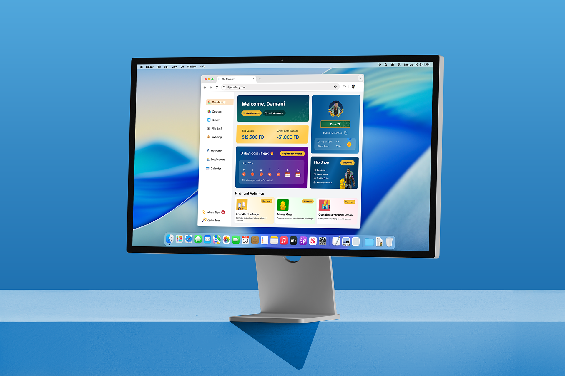
Flip Academy