Kaya
Transforming the roommate search into a compatibility-driven experience
Team & roles
Jesh Anies - UX Research & Design
Laura Trouiller - Mentor
Project Duration
November 2024 - April 2025
Responsibilities
User Research, Wireframing, Prototyping, Usability Testing
Compatibility is Key
Finding the right roommate takes more than shared rent. It takes shared values, trust, and understanding. According to the Pew Research Center, 31.9% of U.S. households are “doubled up,” meaning the space is shared with at least one adult who isn’t a spouse, romantic partner, or college student. That’s nearly 79 million adults living in a housemate-style arrangement. As housing costs continue to rise, sharing space has become common — yet finding someone compatible remains a difficult task.
I experienced this firsthand when I moved to New York. The roommate-search process felt impersonal and uncertain: profiles were shallow, interfaces outdated, and trust was hard to build. While I was fortunate to find a roommate, the journey made one thing clear: there should be a better, more human way to connect people who are looking to share a home.
The problem
Professionals moving to or within a city often struggle to find compatible roommates who share their lifestyle, habits, and budget expectations.
The solution
Design a user-friendly, compatibility-driven app that helps people find and connect with roommates who align with their values and living preferences.
Discovery & Research
Secondary Research
To understand the landscape of finding compatible roommates, I analyzed renter demographics, common pain points, and existing roommate-finding solutions. The research revealed clear gaps in trust, compatibility, and platform reliability.
Who rents & who struggles: Young adults, mid-career movers, older adults, and low-income individuals face the biggest challenges—especially around affordability, safety, and compatibility.
Primary challenges: Trust concerns, mismatched expectations, lack of reliable tools, and limited time to vet potential roommates.
Qualities people seek: Financial reliability, cleanliness, lifestyle compatibility, communication, and respect for boundaries.
Competitive landscape: Existing platforms offer convenience and filters but often lack comprehensive safety features or strong compatibility-driven matching.
Primary Research
To understand the challenges people face in finding compatible roommates, I conducted six user interviews with individuals actively searching for or currently sharing living spaces. Before doing so, I first used a screener survey to identify participants who would provide the most relevant insights, including those with or without a place but looking for roommates, or those currently sharing a space with non-romantic roommates.
Interviews were recorded and analyzed using an affinity diagram, helping me identify key patterns and common pain points.

After synthesizing my data, I boiled down the insights to 6 key themes:
People prioritize trust, cleanliness, respect, communication, and financial reliability when choosing a roommate — confirming secondary research.
Face-to-face interaction (in person or video) was essential for assessing personality, trustworthiness, and overall “vibe.”
Setting expectations early helped prevent conflicts; participants wished they had clarified boundaries during the vetting stage.
Personal networks were a primary starting point, with referrals and friends offering built-in trust before turning to apps.
Roommate searches commonly took 2–3 months, depending on urgency and local housing conditions.
Formal vetting tools like letters of recommendation or financial verification were valued and sometimes already used by participants.
Persona
From the interview insights, a persona was developed to represent a professional actively searching for a compatible roommate in a new city named Emily. Her story guided design decisions, keeping compatibility, communication, and trust at the forefront of every feature. Designing with Emily in mind ensured the solution met both practical and emotional needs, from lifestyle alignment to fostering a harmonious living space.

Jobs to Be Done & How Might We Questions
Based on my research, Emily’s main goal was to find a compatible roommate while minimizing risk and stress. She needed tools to filter potential roommates by budget, lifestyle, and values; communicate effectively; and verify trustworthiness. This understanding of the persona, organized in a Jobs To Be Done framework, became the foundation for key design opportunities framed through these guiding questions:
How might we increase access to reliable roommate profiles?
How might we reduce the time spent searching for roommates?
How might we enhance communication between potential roommates?
How might we promote trust and safety when looking for potential roommates?
From Insights to Concepts
User Stories
Using the insights from research and the How Might We questions, I brainstormed ideas to help users find compatible roommates. I focused on features that foster trust, highlight shared preferences, and streamline the search process. Next, I prioritized the top 10 user stories that would be included in the Minimum Viable Product (MVP) and define the key moments in a user’s journey.
As someone who’s building a profile, I want to enter details such as moving location, habits, interests, work schedules, lifestyle preferences, preferred living arrangements etc. so that others understand who I am and to find someone with similar preferences and move-in timeframe.
As someone who’s in the middle of their search, I want to look at user profiles so that I can find a compatible roommate.
As someone who’s in the middle of their search, I want to start a conversation so that I can gauge their personality.
User Flow
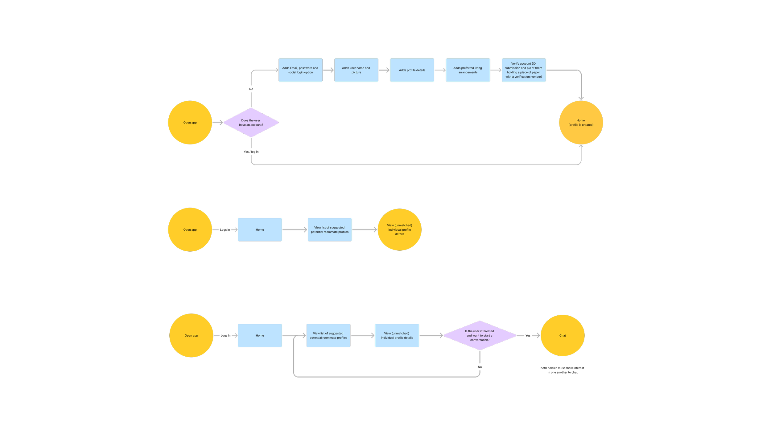
To visualize how users would accomplish tasks from start to finish, I created user flows for each story. These flows ensured that navigating through the app felt seamless and intuitive, reinforcing the theme of compatibility at every touchpoint. Users could easily move from discovering compatible profiles, initiating conversations, scheduling video calls, to verifying trust and making decisions — all without friction.
Bringing the Solution to Life
Sketches
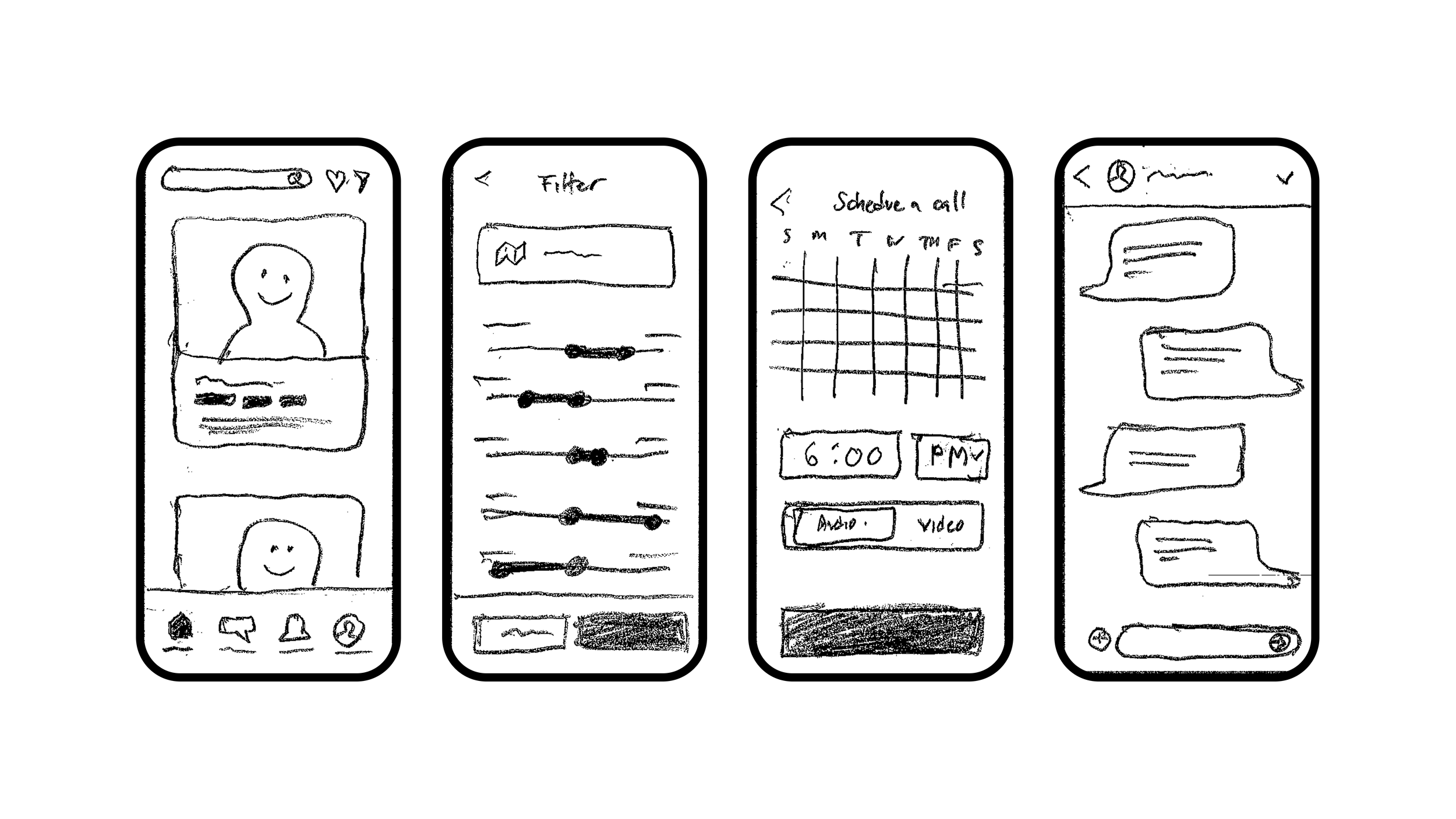
After defining user stories, flows, and the sitemap, I sketched potential interfaces to visualize how users could find compatible roommates. These were needed to clearly communicate ideas for feedback through guerilla usability testing. When reviewing the sketches with participants, they quickly grasped the app’s purpose, noting familiar UI patterns inspired by dating, travel, and social media apps.
Wireframes

With insights from testing, I built wireframes in Figma, creating the digital framework for helping users find compatible roommates. Live copy, grid systems, and type hierarchy were incorporated to improve clarity and establish spatial relationships between components.
A key takeaway from guerilla usability testing was to hone the onboarding process to personalize a user’s profile more easily and with more clarity. Additional refinements include:
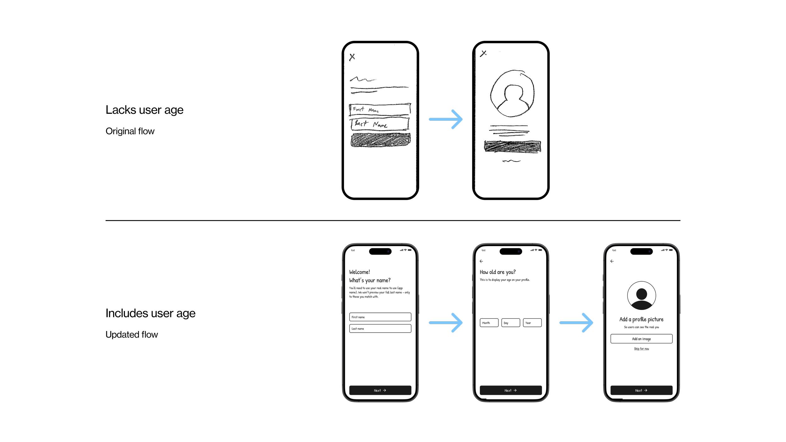
Adding a birthday, to let other users know your age.
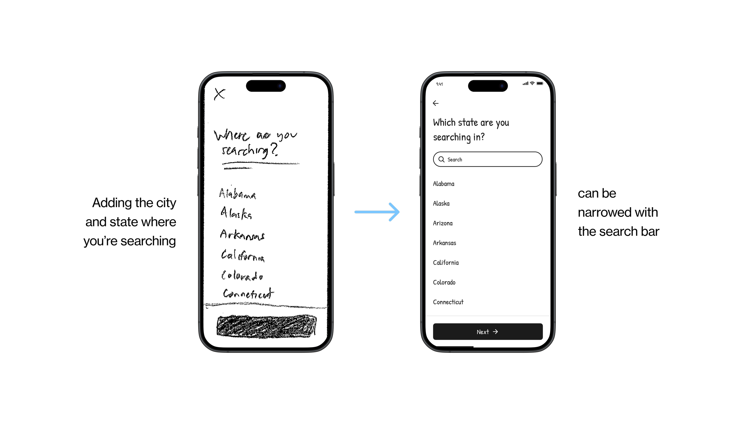
Including a search bar to state and city pages, to quickly find where they’re searching.
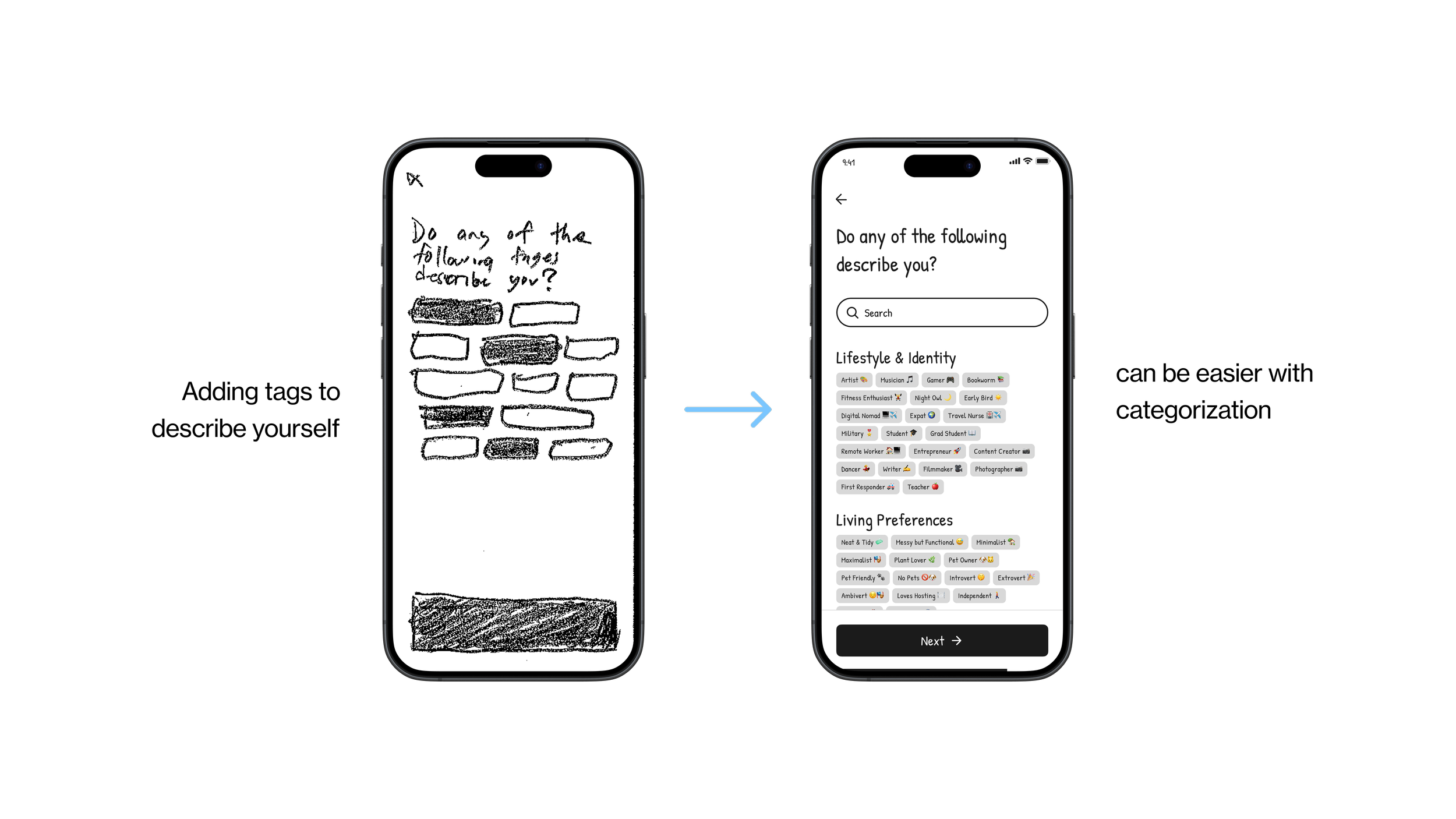
Categorizing tags, making it easier showcase your personality.
Building the Brand
Prior to testing, I created an extensive brand and design system that would be applied to my concept, thus transforming the wireframe into high-fidelity prototypes. This would further flesh out my ideas so that the solution closely resembles an experience that exists in the real world.
Brand Platform

Kaya was named for its short, memorable sound and its association with warmth and balance. Its mission was to help people find compatible roommates by fostering meaningful connections rooted in personality, lifestyle, and shared values. This framing positioned roommate-finding as more than a transaction, shifting it toward harmony, trust, and mutual understanding rather than chance.
The brand was shaped to feel like a trusted guide. Kaya aimed to reduce uncertainty and stress by making the experience feel approachable and modern.
Core attributes that reinforced this foundation include:
Welcoming — creating a sense of comfort and ease
Smart — prioritizing compatibility through intentional matching
Intuitive — guiding users naturally through the experience
Trustworthy — building confidence and safety throughout the journey
Modern — designed for today’s diverse lifestyles and living situations
Together, these elements ensured the brand supported the central theme of compatibility at every touchpoint.
Accessible Visual Identity
Kaya’s visual identity was designed to feel warm, approachable, and accessible.
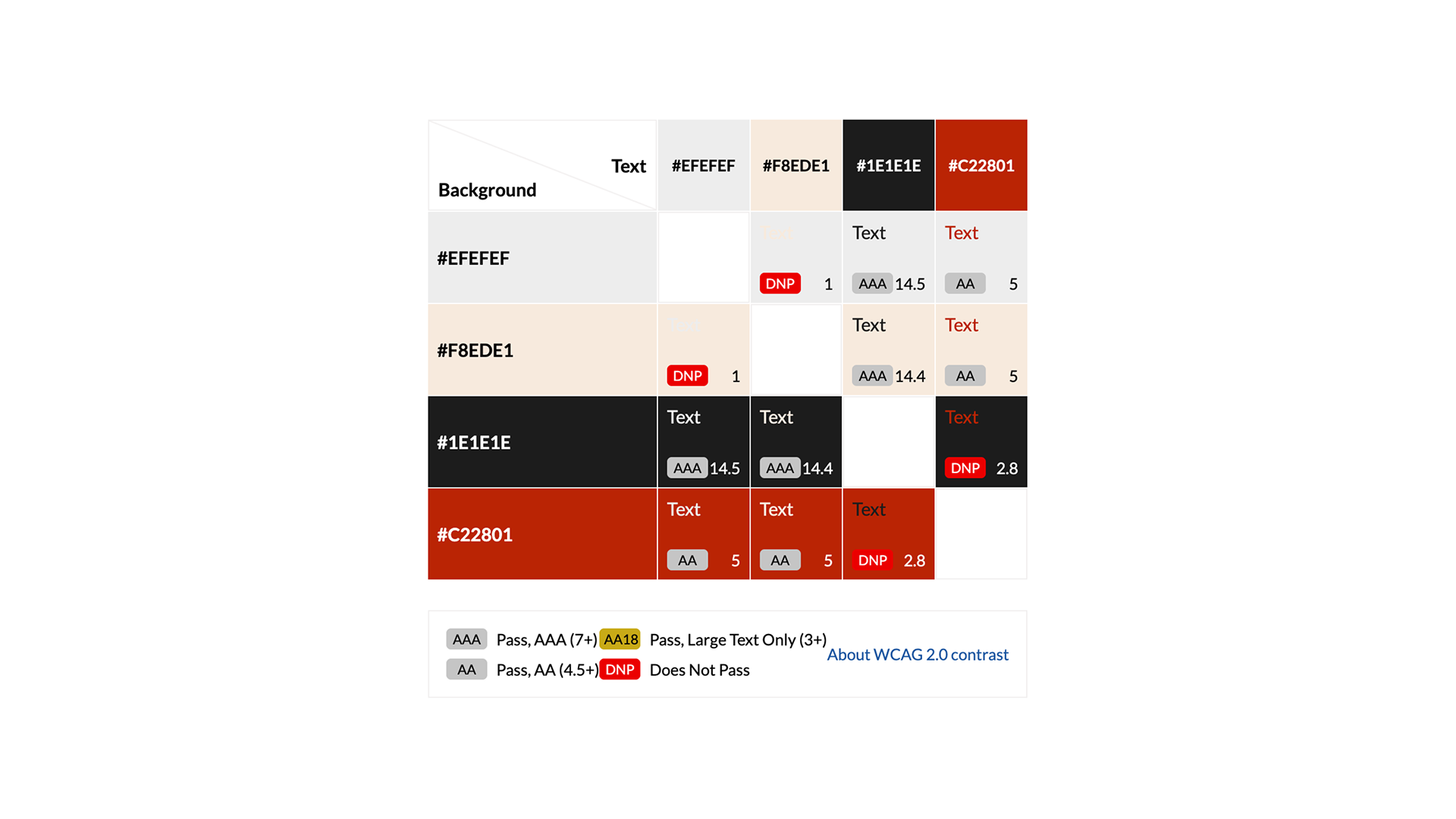
A burnt orange primary color anchored the brand and was reserved for key actions like CTAs, while a neutral palette of black, off-white, and light gray supported strong contrast and visual hierarchy. Together, these choices ensured clarity and WCAG 2.0 contrast compliance across text, backgrounds, and interactive elements.
Typography centered on Neue Haas Grotesk for its screen legibility and balanced proportions. Clear weight distinctions between headers and body copy improved scannability and reduced cognitive load, making content easier to read across devices. Supporting photography and icons reinforced a human, inclusive tone without competing with usability or accessibility.
UI Elements

Once the visual identity was set, I designed a library of components that would frequently be used in the prototype. In Figma, these components were created so that adjustments to the master element would apply to all the matching elements within the prototype, streamlining the design process.
Hi-fidelity Prototype

Applying the brand and design system resulted in a polished, interactive high-fidelity prototype of Kaya, setting the stage for usability testing.
Testing the Solution

After completing the initial high-fidelity prototypes for Kaya, I conducted two rounds of usability testing with 5 different participants for each to evaluate how easily users could navigate the app, discover compatible roommates, and complete key tasks. Overall, participants found the app “intuitive and engaging”, quickly understanding how to explore profiles and assess compatibility. Their feedback highlighted areas to refine the experience and ensure trust and compatibility remain central to the app.
Critical Feedback


One critical piece of feedback was the need for users to track their connection invitations. Participants valued transparency when connecting with potential roommates, and unlike dating apps where invitations are often hidden in the back end, Kaya required a more personable front-end solution. To address this, a page was added to track invitations, and users could include a short message when sending an invitation adding a human touch to the connection process.

Similarly, I included an option for users to include a message when archiving conversations if they’re no longer interested, considering some users may prefer manually sending a note rather than letting the app notify the other user.
Major Feedback
Major feedback improved usability and clarity, helping users navigate, filter, and engage with potential roommates in ways that removed confusion, supported informed decisions, and reinforced the app’s focus on fostering harmonious, compatible living arrangements. Examples included:

Nesting the ‘Log In’ and ‘Create an Account’ pages under a splash page to reduce clutter while maintaining equal hierarchy for both CTAs.

Implementing neighborhood selection during profile creation after participants expressed confusion about location/range settings.

Switching from a heart icon to a bookmark icon for favoriting, preventing misinterpretation as a romantic “match.”
Other feedback to consider
Some valuable suggestions were noted but were not implemented:
Nesting message requests under “Messages” instead of “Explore”. Two participants instinctively looked for pending messages after matching, rather than in the pre-match “Explore” section. Moving these requests would better align with natural user expectations and reduce confusion when tracking potential roommate interactions.
Managing multiple rooms in the same apartment. One participant pointed out that someone offering more than one room could create duplicate listings or overlapping conversations. Developing a workflow for this scenario would help maintain clarity and ensure users can make informed decisions.
Implementing group chat features. In shared living spaces with multiple roommates, a group chat would allow users to communicate collectively, promoting transparency and compatibility among all potential roommates.
Project Highlights
A user-centered solution rooted in compatibility
Every design decision focused on helping users find roommates whose personalities, lifestyles, and values aligned.
Tested for enhanced clarity and usability
Usability tests surfaced critical and major feedback with enhancements that ensured the app was intuitive, easy to navigate, and human-centered.
Harmony between visual identity and interactions
The visual identity, tone, and interactions fostered warmth, trust, and harmony, making the roommate-matching experience feel personal.
What I learned
-
I realized that diving into design without deeply understanding the problem could have resulted in solutions no different from existing roommate apps. Research and insights informed a solution that truly helped users find compatible roommates.
-
Testing sketches and prototypes uncovered important adjustments, such as adding birthday inputs, adjusting onboarding language, and displaying only the first initial of a last name for security.
-
Organizing feedback from critical to normal allowed me to focus on the most impactful changes, improving usability while meeting user needs efficiently.
Selected Works
-
![]()
Qoro
-
![]()
Flip Academy
-
![]()
GalleryPal
-
![]()
Wunderkind
-
![]()
Ocean Spray
-
![]()
Owl Labs
-
![]()
Livingston International